Showing posts with label design. Show all posts
Showing posts with label design. Show all posts
Monday, March 6, 2017
FZD School of Design Workshop 2013
FZD School of Design Workshop 2013
 |
| Final from my workshop this pass weekend at FZD School of Design in Singapore. Around 6 hours of art, art talk, and bad jokes with Feng Zhu. Good times. |
 |
| This is some shots of the later stages of the piece. Adding color, working out design and adding some narrative to the piece. |
 |
| These are some early roughs. Showing some of the basics of how I work. |
Available link for download

Tuesday, February 14, 2017
Frozen Costume Design
Frozen Costume Design

When we think about animated films, and specifically costumes in animated films, we tend to identify characters by 1 or 2 signature costumes. Cinderella had her peasant dress and her magical ball gown. Briar Rose had the same, though her ball gown was constantly shifting from pink to blue (to pink!) Alice has her iconic blue dress, and Peter Pan would not be Peter Pan without his feathered cap and tights!
Well, no such beast was Frozen. While we definitely identified "hero" costumes for our lead characters, the narrative required many, many more costume changes than what is typical for an animated film. Between the sheer number of costumes and the complexity of them (were talking layers of petticoats, pantaloons, tights, gloves, hats, etc) Frozen is probably the most clothed animated film of all time.

The costumes in this film kind of have a life of their own. Whenever possible, they tell a visual story that supports the narrative. The cut, color and detail work on every piece of clothing is designed the way it is for a reason. Anna begins with a bright yellow palette, and she stays in the warm greens throughout the entire time she is growing up. When you meet her as an adult for the first time, she is back in that yellow - the same tenacious girl you met as a five year old.

Elsa, on the other hand, changes rather drastically. You meet her in her pale blue nightgown, and her palette gradually gets deeper and darker as she grows up and closes herself off from the world. Her sleeves get longer and she puts on gloves so that her skin is no longer exposed at all. Even her hairstyles evolve to be more tight and binding.

As adults, the girls are still costumed to reinforce their personality. Elsas coronation gown is regal and restrictive, while Annas coronation gown has inverted pleats for happy, hopeful twirling. Since the coronation is such a formal event, it seemed only fitting that Annas hair be in an updo. To keep her playful, though, we added ribbons to her hair so that she could have a lot of great secondary motion. That same idea of added secondary motion on Anna is present in her traveling cape, where we added pompoms to the seams of the heavy wool fabric that (along with her rosemaling) reinforce her playfulness.

The bulk of my contribution to Frozen was definitely in the costume department. I ran the gamut from working on the sisters, clothing the King and Queen, and dressing the royal guard to refining Oakens fabulous sweater/suspender combo and figuring out what troll clothing looks like I tell you, I will never look at a lining the same way again!


I really hope that somebody manufactures that sweater for adults - I can see a use for it at many an ugly-but-fabulous-sweater Christmas party in the future.
All images are property of Walt Disney Animation Studios
It was actually a little bittersweet to work on the costuming for this film because I frequently realized that while a lot of these clothes would be made into real-life costumes for children, there was slim to no chance that they would ever be manufactured for adults. Like myself. Annas boots?! Come on.
One more Frozen post coming up, and many more updates on the horizon. Thank you again to all who continue to take interest in this little website. Have a wonderful week!
Available link for download
Wednesday, February 1, 2017
French Design Before After
French Design Before After
Today, I’m going to leave Wilton House for now (Part 3 is coming) – to look at some French decor in Houston that I saw! I can’t pass up a house with pretty antiques, especially French ones! Enjoy!!!

Built in 2004, the house was put up for sale and updated, although it was quite beautiful to begin with.
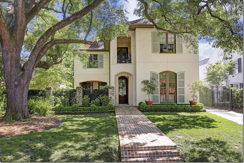
Today: New landscaping, box beds, and shutters painted a light green. The front courtyard is now hidden behind vines and the gravel parking area was grassed over.

Before: The dining room is located off the front door, with a row of lanterns in the foyer hall.

Before: Looking the other direction, there is a fireplace, which is so wonderful in a dining room.

Today: Antique rugs warm up the space.

Filled with French antiques, twin crystal chandeliers. The brown mantel was painted white.

The front hall leads to the family room. At the left is a side courtyard.
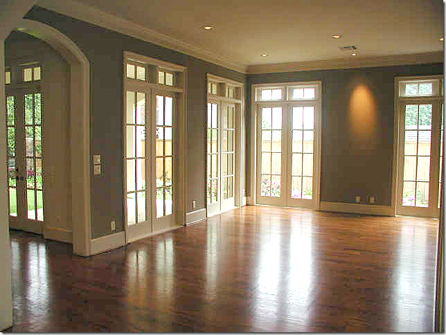
Before: The foyer ends at the family room.
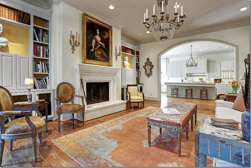
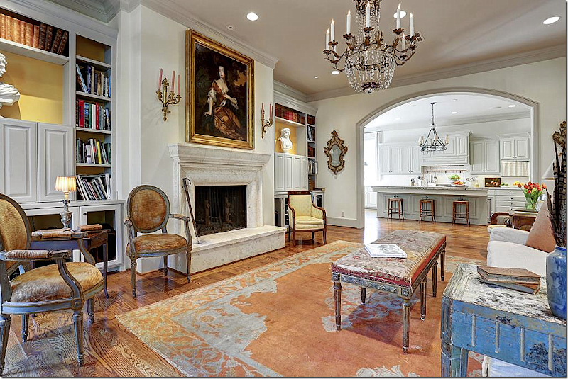
Today: The family room! LOVE LOVE LOVE!!!! I just love this!!!! Can you tell? OK. Nothing beats pretty French furniture, especially like this, when it’s not decorated, it just IS. Love the symmetry of the bookshelves, with the matching busts and the bright yellow background. Love the crystal chandelier. The painting. Love the bench instead of a coffee table.
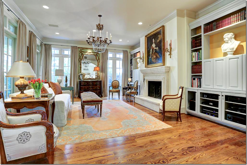
The view toward the other direction.
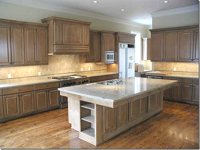
Before: Sea of brown cabinets and yellow granite. So boring.

Ahhhh. Much better. Pretty cream cabinets with a stone topped island. Iron chandelier and checked linen curtains add more interest with texture.

New farm sink with skirt. Love. Arch doorways.
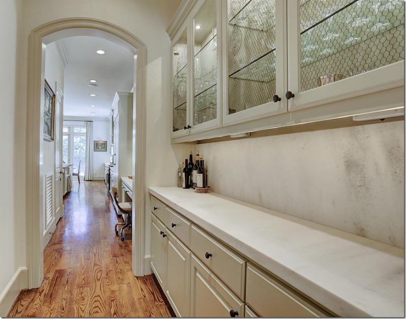
Butler’s Pantry with limestone counters.

Beautiful stairs. Landing with antique rug and chest.

BEFORE: The master bedroom.

Today: The bedroom is a mix of old and new.

Today: Bathroom with linen curtains and crystal chandelier.

Study on second floor – with antique French leather chairs. LOVE!!! Crystal chandelier. French tea table. The husband must hate seagrass. It’s unusual these days not to see any seagrass at all in a Houston house of this style. But so many husbands refuse to have it.

BEFORE: Backyard.

After: The patio, furnished.

After: At the front courtyard, instead of grass, there is now a brick terrace with a fountain enclosed by box. So beautiful!!!! So Houston.

Even the side yard which is typical neglected is landscaped with a lemon trees, box, and brick beds.
This house is for sale, to see the listing, go HERE.

This next house is located in River Oaks, Houston’s most exclusive neighborhood. Built in 2000, it’s a bit more than 5600 sq. ft. The house was sold in 2007 and now it is for sale again.
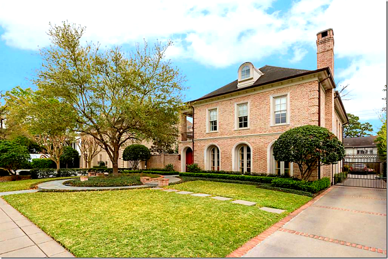
Today: The exterior has remained the same. Why change? It was perfect before! Beautiful landscaping, with an interesting circular bed built around the tree.

Before: You walk into the courtyard, to the front door that is actually on the side – like a Charleston House. Lanterns are lined up along the walkway. Mahogany doors and windows.

Before: A slate terrace with a balcony that overlooks it.

Before: Across the brick wall is a fountain.

Today: The terrace has subtle changes that give a clue to what is inside. The lanterns are gone, the doors are painted white, and the area is furnished in bright colors and metals.
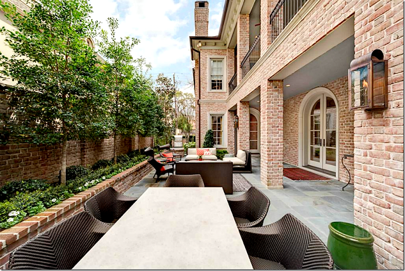
Today: Sofas and dining table turn the terrace into an outside living room.

Available link for downloadRead more »
Tuesday, January 24, 2017
Free The Truth New design for the WikiLeaks Store
Free The Truth New design for the WikiLeaks Store
 |
| ...and the truth shall set you free! |
VISIT THE AUSTRALIA/US/UK/EU STORE*
* WikiLeaks is not aware of any other site that donates the profits, or any money, from what it sells to WikiLeaks. If you want to help WikiLeaks through your purchase of merchandise please use the WikiLeaks Spreadshirt shop.
Available link for download
Subscribe to:
Posts (Atom)